How Big Should Your Face Be in a Profile Photo?
How Big Should Your Face Be in a Profile Photo?
A simple framing tweak that helps you look more present, confident, and easy to talk to.
How Big Should Your Face Be in a Profile Photo?
A simple framing tweak that helps you look more present, confident, and easy to talk to.
Most people don’t choose a “bad” profile photo. They choose a photo they like. The snag is that a
profile photo isn’t really about having a nice picture of you. It’s a small piece of marketing
that works on your behalf, often before you’ve said a word.
And because LinkedIn shows it as a tiny circle next to your name, the crop matters far more than
people expect. A good headshot makes it easy for a stranger to feel, quickly, that you’re
confident, capable, open, and approachable.
Key takeaways
- If your face is small in the frame, you can come across as distant, even if you’re not.
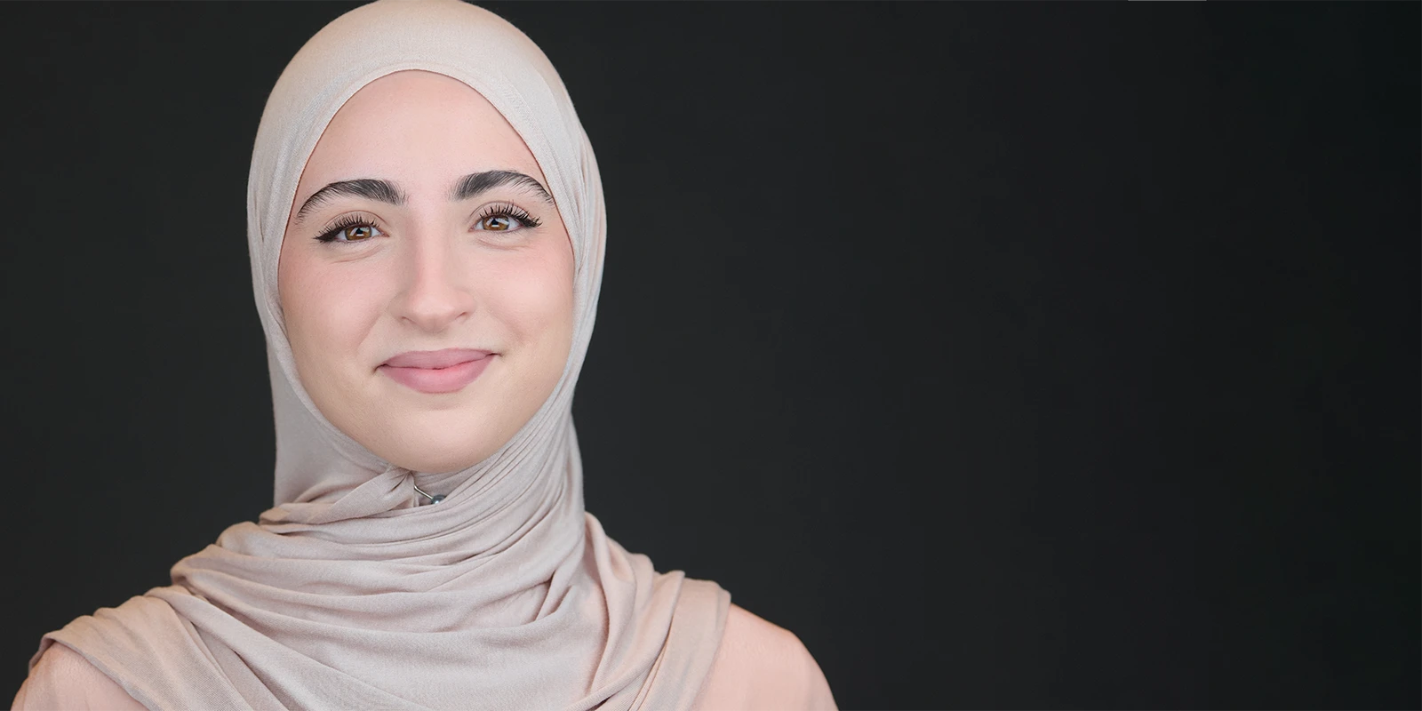
- Head-and-shoulders works because people can actually read your expression at thumbnail
size. - LinkedIn’s own guidance is clear: aim for your face to take up about 60% of the frame.
The “tiny face in a wide shot” problem (and why it’s so common)
Scroll LinkedIn for five minutes and you’ll spot it everywhere: talented, capable people using a
full-length or three-quarter photo where the background is doing most of the talking.
It’s not that the photo is awful. It’s that it’s doing the wrong job. On LinkedIn, your profile
image gets seen as a tiny badge. If your face is small, people can’t recognise you quickly, and
they can’t read your expression.
- It was the nicest photo you had (often
from an event or a wedding) - Wide shots feel safer (less “look at
me”) - LinkedIn isn’t showing the whole photo (it’s showing a tiny circle)
Your profile photo is a badge, not a portrait.
What it can communicate (without blaming anyone)
Nobody uploads a wide shot thinking, “I’d like to look unsure today.”
But when your face is small in the frame, it can quietly read as distance or hesitation,
simply because people can’t see you properly.
✓Distance
You feel further away than you really are.✓Uncertainty
Not “I’m not capable”, more “I’m not sure I should take up
space here.”✓British reserve
The instinct to not put yourself forward too much.✓Harder to trust quickly
If people can’t read your expression, they often keep
scrolling.
What works better: head-and-shoulders for the profile photo, and the banner for the wider story
Here’s the shift that helps most people straight away: let the profile photo be about you, and
let the banner carry the wider context.
Profile photo: keep it head-and-shoulders so your eyes and expression do the heavy lifting.
That’s the part that creates connection and trust.
Banner: use it for the bigger story. Team, workplace, what you do, brand colours, or a simple
line of text. You don’t need your profile circle to show your whole outfit, your whole office,
and your whole life.
A simple guide (with numbers): LinkedIn’s “60%” idea
LinkedIn’s own advice is refreshingly practical: aim for your face to fill about 60% of the
frame. In plain terms, that usually means a crop from the top of your shoulders to just above
your head.
- Face-first framing Your eyes and
expression should be clear at thumbnail size. - A little breathing space Leave a touch
of room above the head so nothing feels cramped. - Quiet background Keep distractions down
so your face stays in charge.
Common pitfalls to watch for
A few quick ones that can change the feel of a profile photo more than people realise:
- Too wide Full-length or
three-quarter shots turn you into a tiny face in a busy feed. - Too tight No breathing room can
feel intense, like you’re leaning in. - Messy background Clutter and
patterns compete with your expression. - Harsh light Overhead lighting
and patchy sun can put heavy shadows around the eyes. - Odd angles Very high or very
low camera positions can change how confident you look.
A quick close
If your face is small in your profile photo, it doesn’t mean you’re doing anything wrong. It just
means the image is doing a different job than LinkedIn needs it to do.
A clear head-and-shoulders headshot is a straightforward marketing tool. It quietly says: I’m
confident, I’m capable, I’m open, and I’m easy to talk to. Then your banner can do the wider
scene-setting around your work.
If your current profile photo isn’t doing the job, I can help. Have a look at how my sessions work or check availability.