The Best Background for a Professional Headshot (And Why Most People Get It Wrong)
When people see a finished headshot, they often focus on the expression. But
quietly sitting behind that expression is something just as important: the background. It's one
of the fastest ways to influence how polished, fresh and confident you look.
Most clients don’t realise it, but the background choice plays a huge part in how their skin tone
reads, how the light falls, and how modern or classic the final image feels. This is why I bring
a set of controlled backgrounds to every session, rather than leaving it to chance.
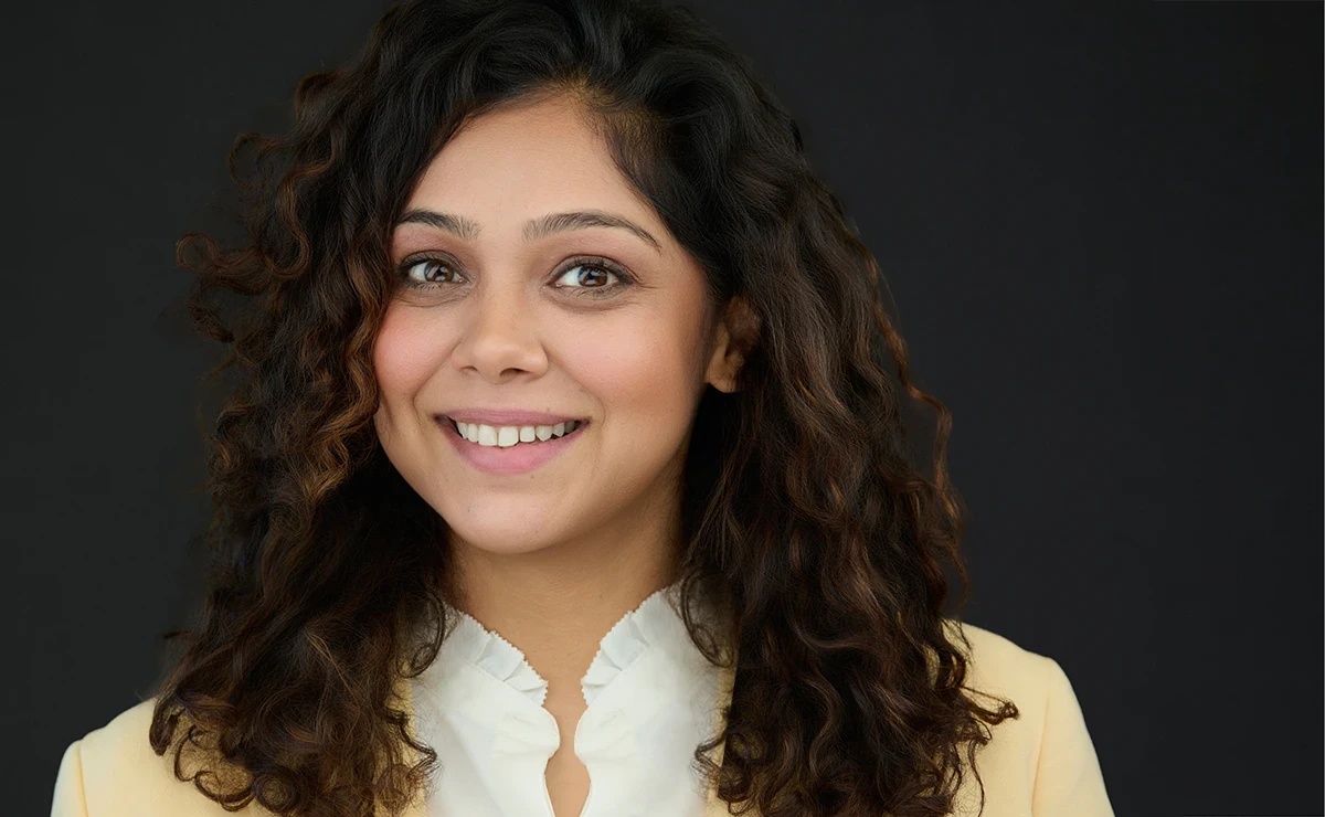
Why Dark Grey Is My Go-To
Dark grey is, hands down, the most flattering background for nearly everyone.
It gives depth, makes skin tones look healthy, and keeps the focus on your eyes and expression.
It’s modern without being trendy, and classic without feeling too formal. Most people see their
test shots on the computer and say the same thing: "Oh wow… that’s me but better."
It’s my default for a reason. It’s the safest, most professional backdrop for LinkedIn, websites,
press releases, speaking profiles and anything else where first impressions matter.
When a White Background Works (and When It Doesn’t)
White is the most popular choice for corporate websites because it blends neatly with modern
layouts. It looks fresh and clean.
But there’s a catch. Without the right lighting and positioning, white can wash people out or
make them appear flatter than they really are. The trick is to light the background separately
so the person stays warm and three-dimensional.
Used correctly, white feels crisp and contemporary. Used casually, it feels a bit clinical. This
is why I only shoot white when the purpose genuinely calls for it, and the lighting can be
controlled properly.
Office and Outdoor Settings
Sometimes a team wants a bit of environmental context: a hint of their workspace, or something
that feels more relaxed and conversational.
These can work well, but they’re the least predictable. Reflections, signage, harsh light and
background movement all need managing. A quick glance around the room doesn’t tell the whole
story; the camera sees things differently.
I only choose an office or outdoor setting when it genuinely adds something to the story.
Otherwise, it risks looking busy or uneven next to people’s expectations of a polished
professional headshot.
The Fine Art Canvas Option
This one is special.
My fine art painted canvas brings a timeless, slightly textured look that feels more like a
portrait than a standard business headshot. It’s subtle, elegant and suits senior leaders,
authors, and anyone wanting a touch of craft in their image.
It isn’t for every brief, but when it fits, it creates something quietly striking and distinctive
whilst still remaining entirely professional.
How I Choose the Right Background for Each Person
Most people don’t know what will suit them best when they arrive, and they don’t need to. That’s
part of the service. Once we start shooting tethered, the decision becomes obvious.
I look at:
- Your skin tone
- Your wardrobe choices
- The purpose of the image
- How the light is behaving in the room
- Whether we want modern, timeless or conversational
Then we try a couple of quick frames with different backgrounds. You see the difference
instantly on the screen.
This isn’t about creating a dramatic backdrop. It’s about finding the setting that helps you look
confident, approachable and unmistakably like yourself.
The Takeaway
Backgrounds don’t shout. They whisper. But that whisper changes everything.
A dark grey backdrop brings out the best in almost everyone. White is crisp and versatile in the
right hands. Offices and outdoor spaces work when chosen with intention. And the fine art canvas
offers a touch of craft for those who want it.
The right background makes your expression sing. The wrong one competes with it.
If you’d like help choosing the right setting for your next headshot session in Exeter, Bristol,
or anywhere across the South West, I’d be delighted to guide you through the options and show
you the difference on screen as we go.